From Seaborn to Matplotlib#
As previously mentioned, one of the major advantages of seaborn is that you can start in seaborn, then drop down into matplotlib to make more fine-grained adjustments using the matplotlib API.
To move from seaborn.objects to matplotlib, the easiest way to is to:
Create a matplotlib subplot object (
fig, ax = plt.subplots()),Create the seaborn.objects plot
use the
.on(ax).plot()method to assign the seaborn.objects plot to the matplotlibaxesobject.work with the
matplotlibaxes object.
Note that this workflow doesn’t always seem to result in an easy to output-in-jupyter-notebook result, but if you save the axes object and then look at it works well. I think if don’t try to look at the output at the intermediate steps, you can see the final result, but if you look at the results as you go it seems to break.
import matplotlib.pyplot as plt
import seaborn.objects as so
import seaborn_objects_recipes as sor


# Load the penguins dataset
import seaborn as sns

penguins = sns.load_dataset("penguins").dropna()
# Create matplotlib subplot axes object
fig, ax = plt.subplots()
# Make a seaborn objects plot
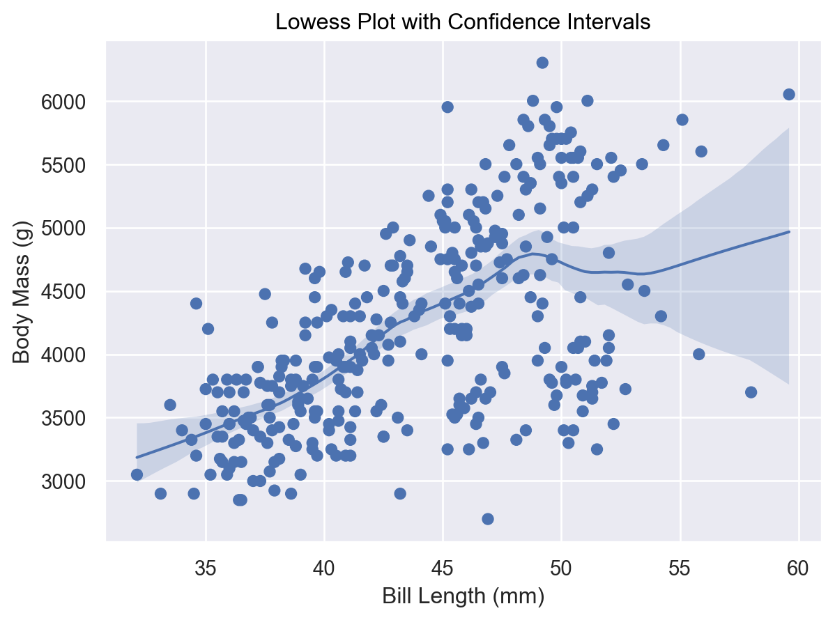
plot = (
so.Plot(penguins, x="bill_length_mm", y="body_mass_g")
.add(so.Dot())
.add(
so.Line(),
lowess := sor.Lowess(frac=0.4, gridsize=100, num_bootstrap=200, alpha=0.95),
)
.add(so.Band(), lowess)
.label(
x="Bill Length (mm)",
y="Body Mass (g)",
title="Lowess Plot with Confidence Intervals",
)
)
plot
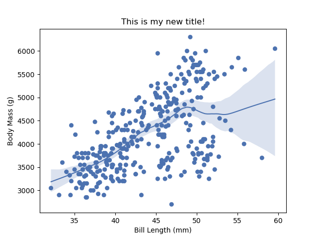
# Assign to axes object and save.
# Note that with this code flow (where output spread across cells)
# you don't seem to be able to show the result in Python.
plot.on(ax).plot()
ax.set_facecolor("white")
ax.set_title("This is my new title!")
fig.savefig("./img/modified_plot.png")
Now load that image:
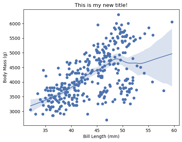
Seeing Output by Combining Code#
And as I noted above, if you put all the code in one cell, it does seem to allow you to see the output live.
# Create matplotlib subplot axes object
fig, ax = plt.subplots()

# Make a seaborn objects plot
plot = (
    so.Plot(penguins, x="bill_length_mm", y="body_mass_g")
    .add(so.Dot())
    .add(
        so.Line(),
        lowess := sor.Lowess(frac=0.4, gridsize=100, num_bootstrap=200, alpha=0.95),
    )
    .add(so.Band(), lowess)
    .label(
        x="Bill Length (mm)",
        y="Body Mass (g)",
        title="Lowess Plot with Confidence Intervals",
    )
)
plot.on(ax).plot()
ax.set_facecolor("white")
ax.set_title("This is my new title!")
Text(0.5, 1.0, 'This is my new title!')
from matplotlib import style
import matplotlib.pyplot as plt
from matplotlib_inline.backend_inline import set_matplotlib_formats
import seaborn.objects as so
import seaborn_objects_recipes as sor
import warnings
warnings.simplefilter(action="ignore", category=FutureWarning)
set_matplotlib_formats("retina")
nick_theme = {**style.library["seaborn-v0_8-whitegrid"]}
nick_theme.update({"font.sans-serif": ["Fira Sans", "Arial", "sans-serif"]})

fig, ax = plt.subplots()
(so.Plot(, x="", y="")
.add(so.Dots())
.add(so.Line(), lowess := sor.Lowess(frac=0.2, gridsize=100, num_bootstrap=200, alpha=0.95))
.add(so.Band(), lowess)
.label(title="")
.theme(nick_theme)
.on(ax).plot()
)